Colour psychology for covers: what actually holds up
Updated on August 10, 2026 · 6 min read
Before reading a single word, whoever sees your cover has already felt something. Colour arrives first — it is processed faster than text and sets the tone of the first impression. Hence the popularity of "colour psychology" guides that promise to tell you exactly what each shade provokes.
It is worth starting with an honest caveat: those meanings are far less universal than they are usually presented. They vary by culture, by context and by industry. White means purity across much of the West and mourning in several Eastern cultures. Red is danger on a warning sign and appetite in a restaurant.
That does not make colour irrelevant — it makes the choice more interesting. What follows is what actually holds up in practice.
What colours tend to communicate
In the context of Western brands, some associations are reasonably consistent. Use them as a starting point, not as law:
| Colour | Common association | Where it shows up |
|---|---|---|
| Blue | Trust, stability, technical | Banking, healthcare, technology |
| Green | Balance, health, sustainability | Natural food, personal finance |
| Red | Urgency, energy, appetite | Retail, promotions, food |
| Yellow | Optimism, attention | Highlights, younger audiences |
| Black | Sophistication, precision | Luxury, fashion, photography |
| Purple | Creativity, exclusivity | Beauty, digital products |
Using these codes has a side effect: the more predictable the choice, the less it differentiates. If every accounting firm in your city uses blue, blue stops communicating trust and starts communicating "one more of those".
The rule that matters more than all of them
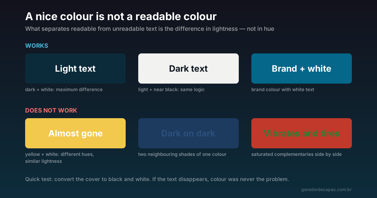
Before any discussion of meaning, there is a practical question that decides whether the cover works: legibility depends on the difference in lightness, not the difference in hue.
Yellow and white are completely different colours, and the pairing is terrible for text — because both are light. Dark blue and white are equally different, and the pairing is excellent — because one is dark and the other light.
One test settles this in seconds: picture the cover in black and white. If the text disappears, the problem was never colour, it was lightness. Some editors let you apply a greyscale filter; if yours does not, squinting until the image blurs produces a similar result.
How to build a palette
The 60-30-10 proportion is an old interior design shortcut that works very well on covers:
- 60% dominant colour: the background. Usually the most neutral or darkest colour in the palette.
- 30% secondary colour: blocks, bands, supporting areas.
- 10% accent colour: whatever should pull the eye — normally the main text or one detail.
Three colours are enough. When a cover has five or six, the effect is not richness: it is indecision. And since the palette has to repeat across every network, the leaner it is, the easier it is to maintain.
Start from the brand colour
If the company already has a colour, it is the base — not one option among several. A cover is a recognition device, and recognition comes from repetition. Choosing a different colour for every post dismantles exactly what the cover should be building.
The remaining two colours can be a dark neutral (for background) and a light neutral (for text). It is the safest combination there is.
And if the brand has no colour yet?
When no colour is defined, the most productive route is not hunting for the "correct" colour for your sector — it is choosing one you can sustain. Three questions help:
- What do competitors use? If the whole sector is blue, a dark green or a graphite differentiates without looking out of place.
- Does the colour work on both dark and light backgrounds? Mid tones tend to be more versatile than very light or heavily saturated extremes.
- Does it sit well with photos? If you use photography often, prefer a colour that coexists with varied images rather than fighting them.
Once chosen, write the hex code somewhere accessible. It sounds like bureaucracy, but it is what guarantees the colour is exactly the same six months from now — and visual identity is built on exact repetition, not approximate.
Identity colour and campaign colour
There is a useful exception to the repetition rule: campaigns. A seasonal promotion can use a different accent colour to signal that something is new — as long as the brand colour stays present and recognisable.
The mistake is the reverse: swapping the entire identity for every campaign. Doing that restarts recognition from zero each time.
Do not forget people who see differently
Roughly one in twelve people with XY chromosomes has some form of colour blindness, most commonly confusion between red and green. If your cover relies on that distinction to communicate something, part of your audience loses the information.
The good news is that the solution is the same as always: guaranteeing contrast in lightness simultaneously solves general legibility and accessibility. A cover that works in black and white works for practically everyone.
Step by step
- Define the base colour — the brand one, if it exists.
- Pick a dark neutral and a light one to complete the palette.
- Distribute at 60-30-10, with the accent reserved for whatever should be read first.
- Open the maker and apply the colours in the structure controls.
- Run the black and white test. If the text disappears, increase the lightness difference before any other adjustment.
- Repeat the same palette on the other networks.
Common colour mistakes
- Light text on a light photo, without darkening the background behind the letters.
- Two saturated complementary colours touching — they vibrate and tire the eye.
- A new palette for every post, which prevents any recognition.
- A colour chosen by personal taste with no relation to the brand or the sector.
- A low-contrast gradient behind text, where half the line reads and half disappears.
Checklist
- Does the palette have at most three colours?
- Is the brand colour present?
- Does the text survive the black and white test?
- Is the distribution roughly 60-30-10?
- Does the same palette repeat on your other networks?
With the palette settled, typography is the natural next step — together, those two decisions define almost the whole identity of a cover. Continue with the best typefaces for covers.
Frequently asked questions
Is colour psychology scientifically proven?
Partly. There are consistent effects around contrast, salience and preference, but the meanings assigned to individual colours vary considerably by culture and context. Use the associations as a starting point, not a fixed rule.
What is the best colour for a professional cover?
There is no single answer. The safest choice is to start from your brand colour and complete it with a dark neutral and a light one. That guarantees recognition and contrast at the same time.
How many colours should I use on a cover?
Up to three. One dominant for the background, one secondary for supporting areas and one accent for whatever must be read first, roughly at a 60-30-10 proportion.
How do I know if my colours have enough contrast?
Picture or convert the cover in black and white. If the text disappears, the difference in lightness is insufficient — and no choice of hue will fix it.
Can I change colours for campaigns?
You can change the accent colour to signal novelty, as long as the brand colour stays visible. Swapping the whole identity for each campaign makes recognition start over from zero.
Test your palette now
Free, no sign-up, high-resolution download.