Consistent visual identity across every network
Updated on August 10, 2026 · 6 min read
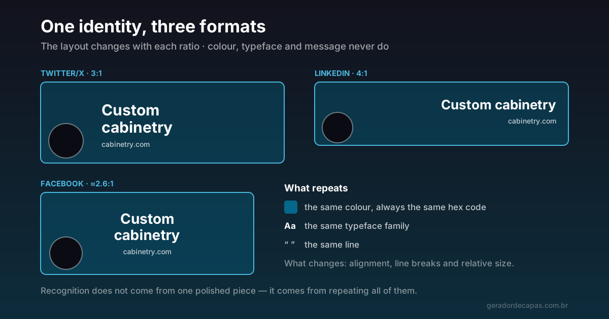
Strong brands are recognised before they are read. That does not come from a brilliant logo: it comes from repetition. When your networks speak the same visual language, every appearance reinforces the previous one — and that is how a name sticks.
The trouble is that covers tend to be made one at a time, at different moments, with no reference to the earlier ones. The result is a set that looks like four similar companies rather than one.
What to fix and what to adapt
Consistency does not mean using the same image everywhere — that is not even possible, because the ratios differ. It means separating what never changes from what always does:
| Fixed across every network | Adapted per format |
|---|---|
| Colour palette (same hex codes) | Text alignment |
| Type family | Line breaks |
| Main message | Relative element sizes |
| Tone of voice | Signature position |
The left column is the identity. The right one is layout only — and layout has to change, because text that fits comfortably in a 3:1 header gets cramped in a 6:1 strip.
Build a mini brand guide
You do not need a thirty-page document. You need a ten-line note, kept somewhere accessible, with:
- The hex codes of your colours. Exact, not "that blue". An approximate colour does not build recognition.
- The typeface names and the weights used at each level (primary, support, signature).
- The standard line that appears on your covers.
- The formats you maintain and the size of each.
That note is worth more than it looks: it is what lets you rebuild a cover eight months from now with the same result, without guessing what was used before.
Start with the tightest format
When creating a new standard, start with the shortest format you use — normally the LinkedIn company cover, at 191 px. If the message fits there, it fits anywhere.
The reverse is the classic mistake: laying everything out comfortably on the X header, which is tall, and then discovering that none of it works in the short formats.
Coherence goes beyond the cover
The cover is the most visible piece, but not the only one. A few points often left out of the standard, and which give the inconsistency away:
- The profile photo. Ideally the same image on every network. Changing the avatar between platforms is the fastest way to look like different profiles.
- The description. If the cover says "custom cabinetry" and the bio talks about "integrated interior solutions", there are two brands competing.
- Post images. Same palette and same typeface as the cover, wherever possible.
Signs your identity is inconsistent
Inconsistency is not always obvious to someone who lives with the brand daily. A few signs that usually give the problem away:
- You cannot state your colour code from memory, nor say where it is written down. If the colour is picked by eye each time, it is never the same twice.
- Every cover uses a different typeface, usually because they were made in different tools at different times.
- The line changes per network. On one you are a "financial consultant", on another a "finance specialist" and on the third a "business mentor". To you they are synonyms; to a visitor they are three positionings.
- The screenshots side by side bother you. That is the most honest test: gather the covers on one screen. If the set looks disconnected, it is.
- Nobody recognises a post of yours without seeing the name. That is the final symptom — the identity is not doing its job.
None of these signs is serious on its own. Together, they explain why an active digital presence sometimes builds no recognition at all.
When to break the pattern
Consistency is not rigidity. Campaigns can and should stand out — the care needed is keeping some element of recognition. A different accent colour with the same typography and the same alignment is still, visibly, you.
What does not work is changing everything: colour, typeface and structure at once. That is not a variation of the brand, it is a new brand — and recognition starts over from zero.
Step by step to standardise
- Survey what exists today. Open all your profiles and screenshot each cover. Seeing them together reveals the inconsistencies immediately.
- Pick the winning standard. Usually one of the current covers is already closest to what you want. Use it as the base rather than starting from scratch.
- Write the mini brand guide with colours, typefaces and the line.
- Rebuild starting from the shortest format and work up to the taller ones, in the maker.
- Publish everything on the same day, if you can. Swapping gradually leaves the set inconsistent for weeks.
- Store the final files in a single folder, along with the note.
Checklist
- Are the colours exactly the same on every network?
- Does the typography repeat?
- Is the main message the same?
- Is the profile photo identical across profiles?
- Is there a note with colours, typefaces and formats?
- Are the final files stored in one place?
Done carefully once, this set becomes routine: on future swaps you replace the line and keep the structure, turning hours of work into a few minutes.
Frequently asked questions
Do I need the same cover image on every network?
No — it would not even be possible, because the ratios differ. What repeats are the palette, the typography and the message. The arrangement of elements has to be adapted to each format.
Where do I start standardising my networks?
With the shortest format you use, normally the LinkedIn company cover. If the message fits there, it fits in all the others. Starting from the tallest format usually creates rework.
What is a mini brand guide?
A short note with the hex codes of your colours, the typeface names and weights used, the standard line for your covers and the formats you maintain. It exists so you can reproduce the same result months later.
Can I change the look for campaigns?
Yes, as long as you preserve some element of recognition — usually the typography and the structure. Changing colour, typeface and layout at once creates a new brand rather than a variation.
Does the profile photo need to be the same everywhere?
Ideally yes. The avatar appears next to the cover on every platform and is the most immediate recognition element. Varying it between networks is the fastest way to look like different companies.
How long does it take for a visual identity to be recognised?
There is no fixed timeframe, because it depends on how often people are exposed to the brand. What can be stated is the mechanism: recognition comes from exact repetition. Every change of palette or typeface resets part of what had been built, which makes consistency more decisive than time.
Is it worth redoing all the covers at once?
Yes, whenever possible. Swapping gradually leaves the set inconsistent for weeks — exactly the problem you are trying to solve. Ideally, prepare every version first and publish them on the same day.
Standardise your covers now
Free, no sign-up, high-resolution download.